(or is it?)
Graphic design. Fonts. Colour. Margins. As a young teenager they held a strange fascination for me. On reflection, graphic design is a job that would have suited me well. However, as is so often the case, life took me down a different road and any fond ambitions I had of kerning words at midnight, moving logos three mm to the right then back again, or deciding which curly apostrophe was the right one for a Sunday remained a distant dream.
The fork in my career path did not stop me doodling and designing on every available surface for the next half century, so creating the logo for this new site should really have been a piece of cake, right? Ha! If only.
It took a little over two months, on and off, in the end. Several hundred attempts. Maybe more. I lost count somewhere around the part where I was choosing between two shades of blue (or should it really be teal?) that are, I now realise, indistinguishable. I have spent my working life dealing with colour in one way or another and I still managed to lose four days to that decision.
The brief was straightforward and therein lay the deception. I wanted it to look hand-crafted, obviously, because I do not want this site to look like it’s advertising a software product. But I did not want hand-crafted in the way that says surfboard shop, or beach cafe, or any of the liveries coffee shops get conscripted into when someone goes mad with a faux typewriter font and some hessian sacking. The corridor between obviously-machine-made and obviously-trying-to-look-beachy is narrower than you might imagine.
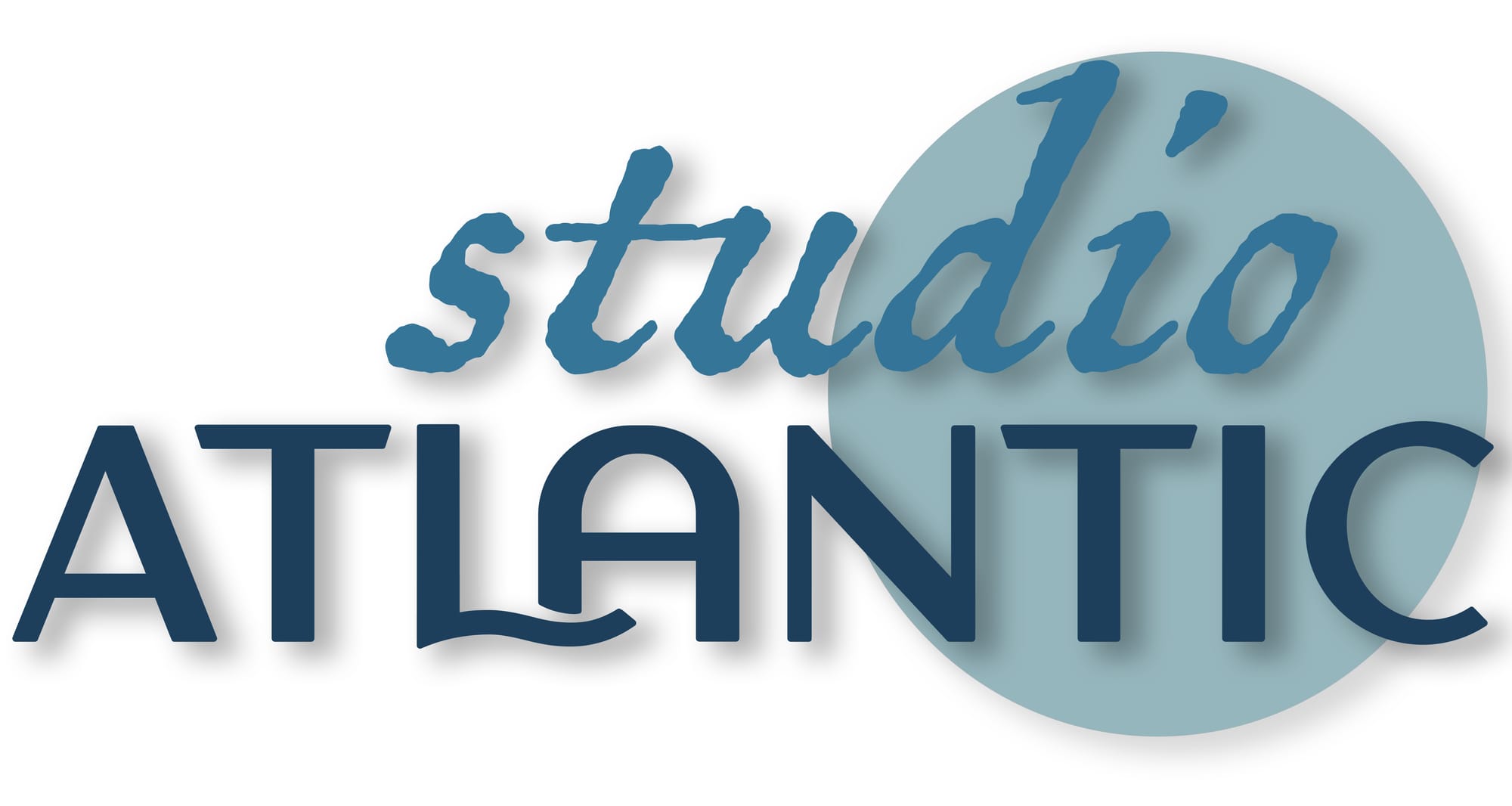
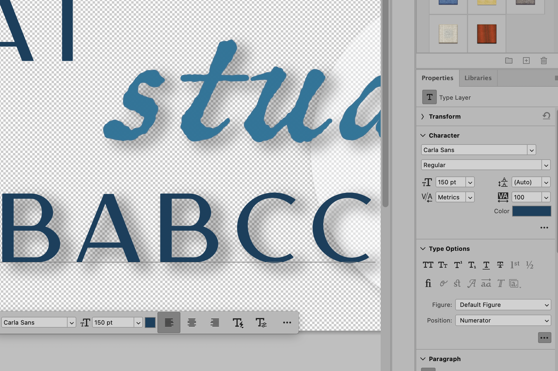
Fonts. Variations on fonts. Size. Variations on size. To capitalise or not to capitalise? That is the question. What about the memory I have largely repressed of a week wrestling with a circle that was altogether the wrong size? I hope I never have to revisit it. In the end the circle went.
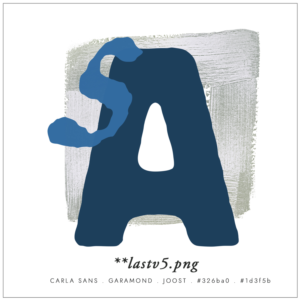
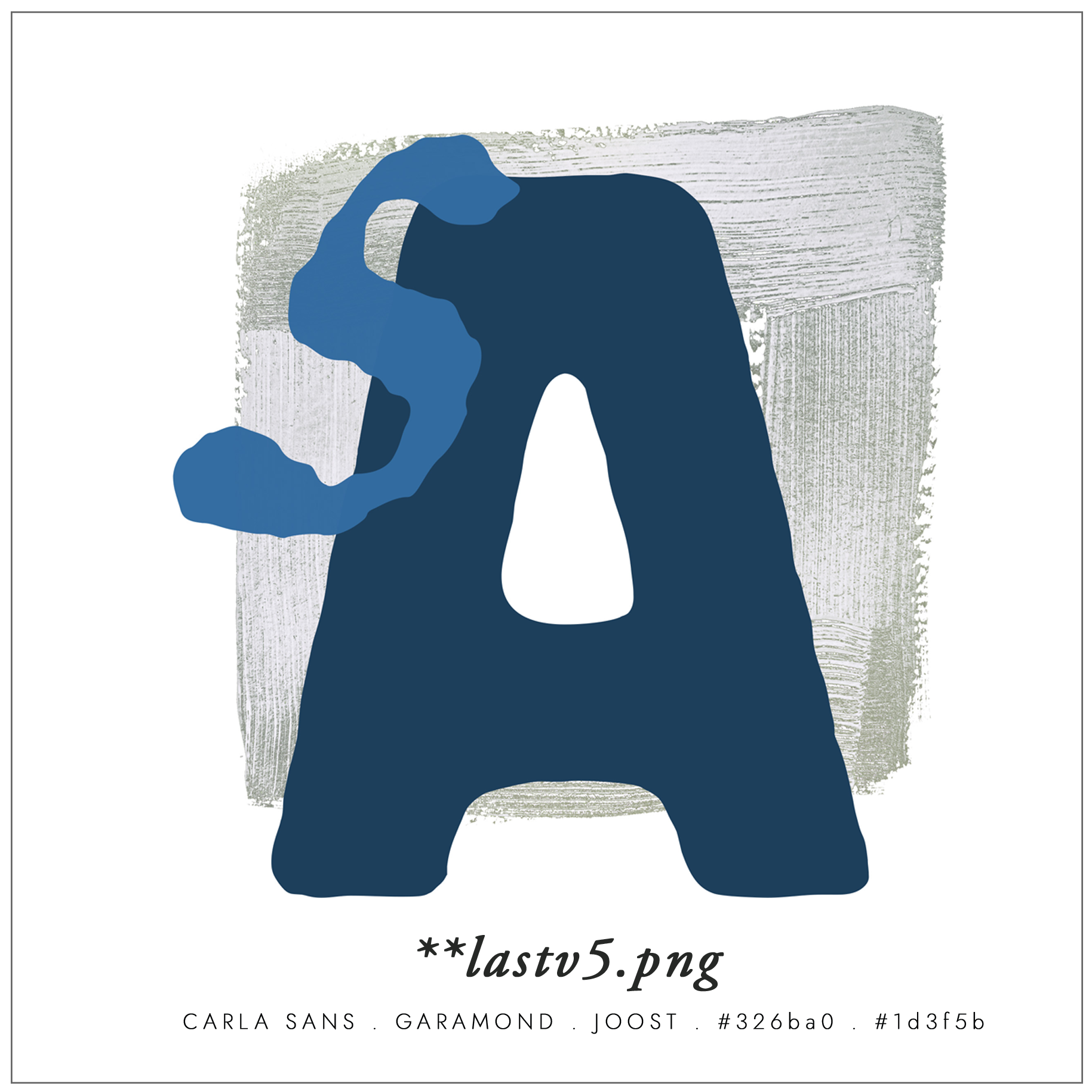
Should I use a clear .png file with no background? Or a solid background? And if there is a background is it too obvious to make it the setting sun? I see a hard drive that now looks like a small museum of indecision, with folders called FINAL, followed by FINAL 2!!!, followed by !!!LastFinal v3 (this one).
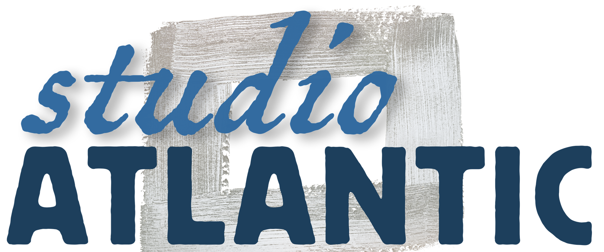
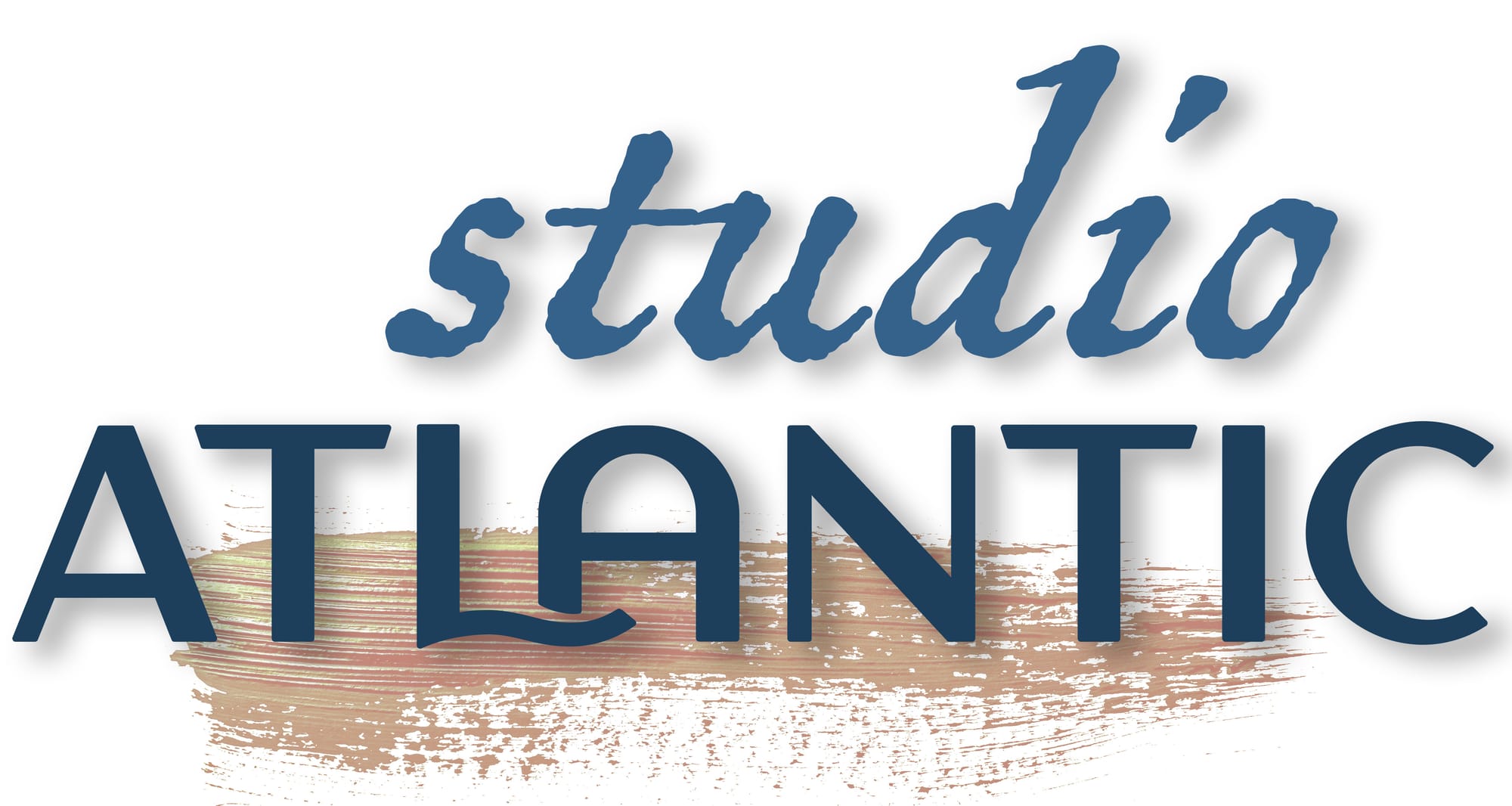
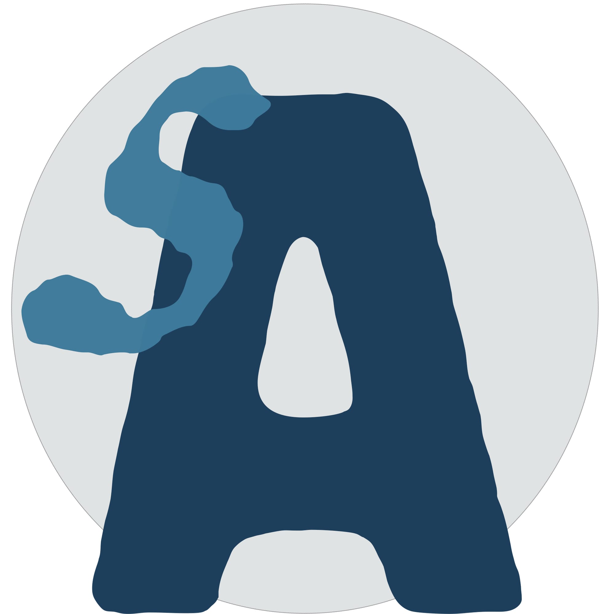
What I have at the end of all this is a circle, two shades of blue, one word in a font close to something that might have been made with a brush and one word in a thick hand-cut sans that may have been made with a letterpress. There is also a square version with just the A, because that is what the favicon needs. Total visible labour: roughly five seconds of looking. Total actual labour: an embarrassment. Let's not even start counting.
This is, I think, what simplicity actually means. Not the absence of work but the long unobvious presence of it. Margaret Calvert, a British typographer and graphic designer, spent years on the British road sign system, and the genius of it is that you have never noticed. Most design that looks easy took a great deal of time to look that way.
I am pleased with the result. Or as pleased as I can be. I am also slightly mourning the version of me who could have done this for a living. My 15-year-old self would have loved being asked to draw a logo. She would also have been astonished that the same person who once spent a week in December designing a festive wrapping paper and ribbon colour scheme would, decades later, lose four days to a particular shade of blue.
What I wanted, after all of it, was something that looked as though it had simply arrived - unforced. Spontaneous. Inevitable. Which is, of course, the most laborious thing in the world to fake.
%0A%0AGraphic%20design.%20Fonts.%20Colour.%20Margins.%20As%20a%20young%20teenager%20they%20held%20a%20strange%20fascination%20for%20me.%20On%20reflection%2C%20graphic%20design%20is%20a%20job%20that%20would%20have%20suited%20me%20well.%20However%2C%20as%20is%20so%20often%20the%20case%2C%20life%20took%20me%20down%20a%20different%20road%20and%20any%20fond%20ambitions%20I%20had%20of%20kerning%20words%20at%20midnight%2C%20moving%20logos%20three%20mm%20to%20the%20right%20then%20back%20again%2C%20or%20deciding%20which%20curly%20apostrophe%20was%20the%20right%20one%20for%20a%20Sunday%20remained%20a%20distant%20dream.%0A%0AThe%20fork%20in%20my%20career%20path%20did%20not%20stop%20me%20%0A%0Ahttps://www.studioatlantic.art/lastv5-png/)