
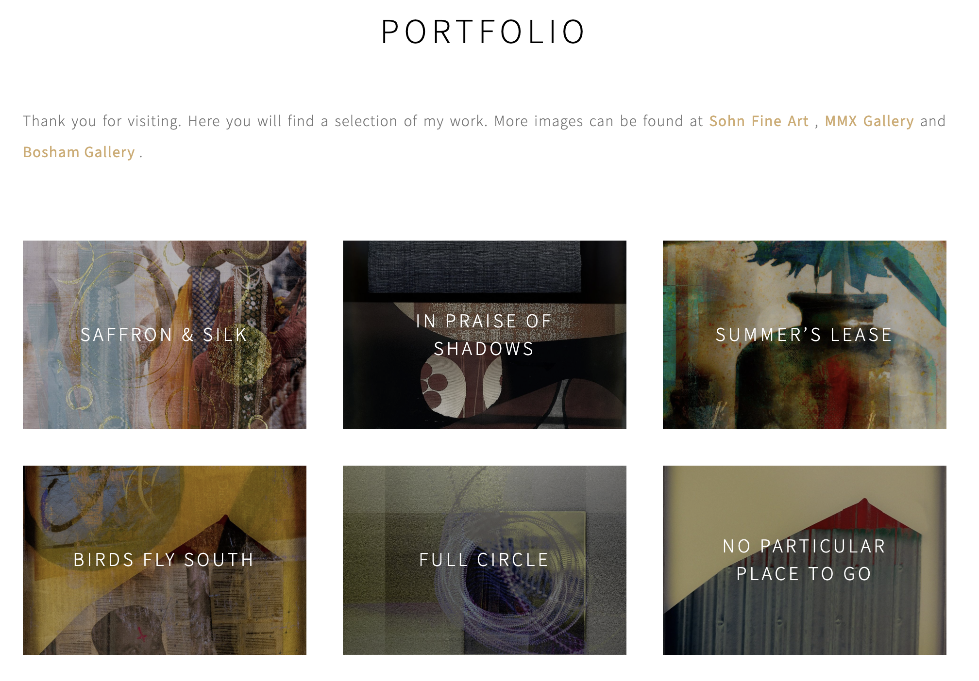
For years the advice was the same, and I took it. A photographer's website should be a white room. Black or grey text, kept small. Nothing to distract from the pictures, no clutter, no personality. Let the work speak for itself. So I built mine that way. valdabailey.com is a clean grid of images on a pale neutral ground, just like all other artists' sites are clean grids of images on pale neutral grounds. It ticked all the boxes – albeit with a few defiant black rectangles dotted around. The epitome of restraint and good taste.
I have started to question that decision. Sometimes I think the presentation was an act closer to disappearance. Or perhaps, self-removal. Get out of the way. Let nothing of the person interrupt the looking. Noble enough as an instinct I suppose. But "let the work speak for itself" assumes the work can speak, and that whoever arrives already knows how to listen. Much of the time, of course, they don't. They land on the page, they scroll a grid of images, and they leave knowing roughly what they knew before.
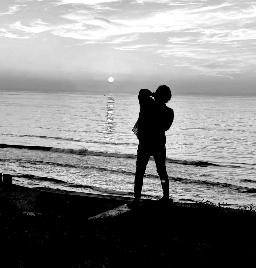
Let me, for a moment, connect this to AI. There are reports aplenty that more than half of new writing published online is machine-made, and headlines claiming most of the content on the web is now generated rather than authored. The figures are argued over and probably unprovable. But you don't need the statistics to feel the shift. You feel it in the way search results are now produced, in the faintly synthetic gloss on a feed of flawless golden-hour photographs, and in the small question that now attaches itself to anything that catches our eye. Was anyone actually there?
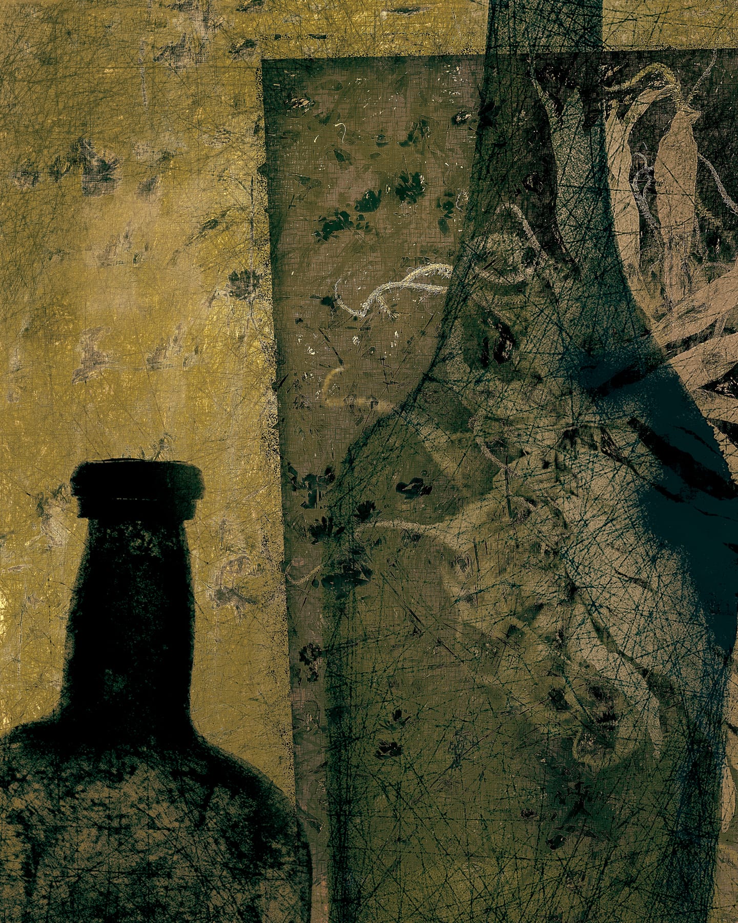
It seems to me a clean grid of accomplished images on a white background is precisely the thing a machine makes best. The well-balanced abstract, the tasteful minimalism, the portfolio template that holds it all tidily and at a respectful distance: these are the easiest things in the world to generate now, because they were already designed to remove the evidence of a human maker.
Most of us have spent years finding our voice, then refining and developing our work, only to go on and buff away our own signature by the way we present it. I am not calling for a return to clutter for its own sake, or gratuitous noise mistaken for personality. . But it seems to me the white room no longer proves anything very much. It cannot show that a person stood somewhere in bad weather, got cold, waited, got it wrong, came back the next day. It shows a result, and, in 2026, results have become cheap.
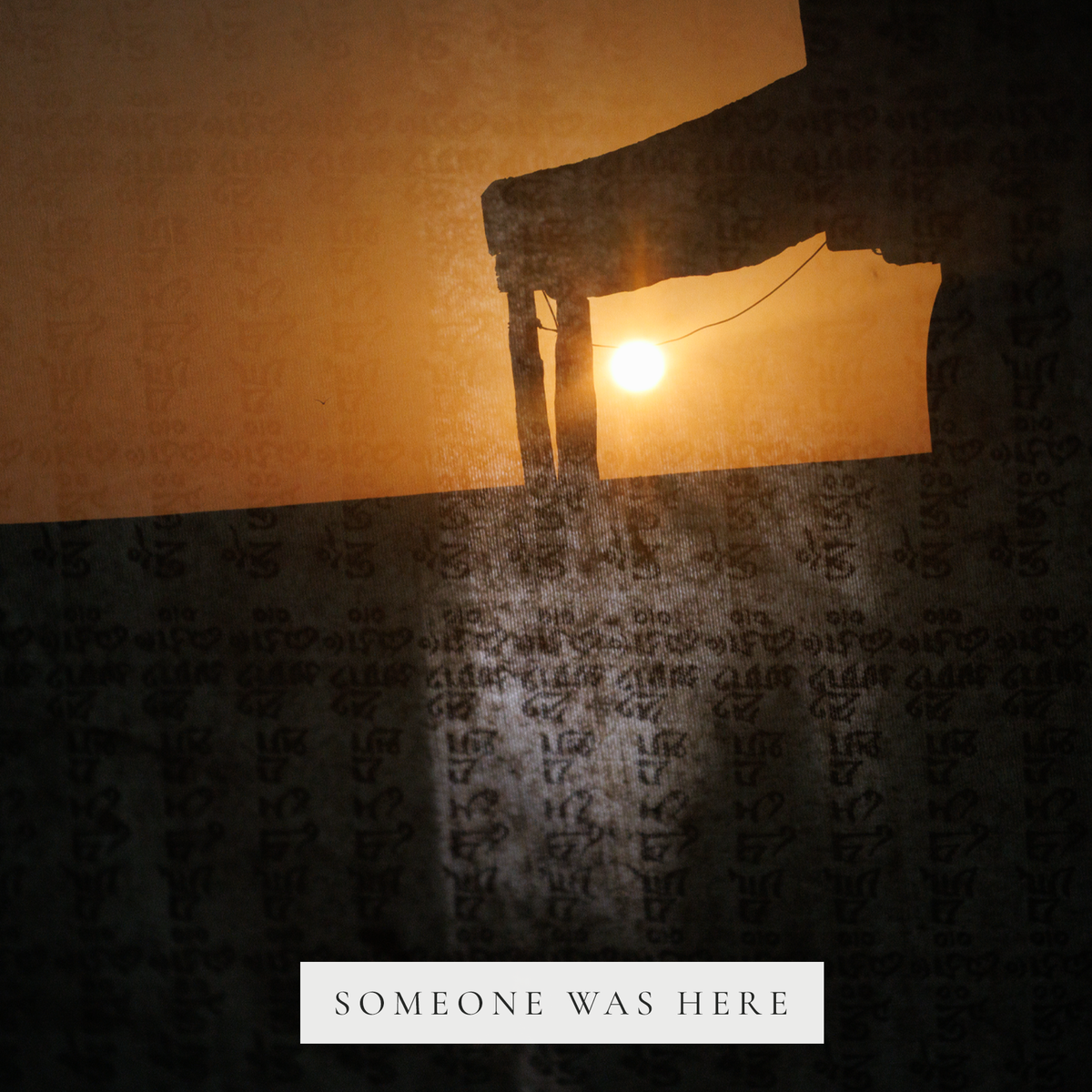
Let's return, as I so often do, to Agnes Martin's grids. From across a room they look ruled, mechanical, almost printed. Up close the pencil line wavers. The hand pressed harder here, drifted a little there, maybe wobbled imperceptibly toward the edge. That waver is the painting. It is the proof that a person sat for hours doing by hand something a machine could have done more evenly, and that the unevenness was the entire point. The grid is not the work. The hand inside the grid is the work! Of course it is. And that is exactly what so many portfolio sites are built to hide. Yet isn't it the one thing that has suddenly become worth showing? The evidence of the hand of the artist. Not the evidence of a machine at work.
I have been frustrated by the usual channels by which we share our work for some time now. My website feels stale. It gets visitors, sure. But I never go there. I don't have the heart for it, and I have been trying to figure out why. I feel even more repelled by Instagram. Do I need a better gallery? Different work? A makeover? No. None of those things. The problem, I think, is that I want almost the opposite of what a gallery is, with all its straight lines, perfect margins and aesthetic purity.
You may or may not be aware that there is a quiet revival going on online – the indie web: people building their own sites again, hand-made and a little wonky, owning the domain, linking to one another through web-rings in the way the early internet did before the platforms tidied everything into feeds. Re-wilding the internet.
What that movement prizes is the very thing the portfolio template strips out: evidence of a visible and particular person. Never being one to hold back when it comes to jumping on a bandwagon, I have decided to tap into a few of the ideas and create a new online presence for words and images.
Yes. A blog. A blog, in 2026. I know. But the dated thing turns out to be the alive thing (the longer story of why, and why it lives where it does, is in A Forest, Not a Plantation). I will do some writing. I intend, in time, to leave the working notes where they can be seen. I also want a space that behaves like a room rather than an endlessly scrollable feed
The gallery on my existing website shows what I made. It does not show that it was me who made it, or why, or what I ruined along the way. For any of that to be shared I need to write. And although I can do that on my current website, I feel the need to start anew.
And in that, there is an irony that I can't readily blow away. The writing, the blog, the paragraph beside the picture, is the form a machine fakes most fluently of all. Anyone can ask an LLM for five hundred warm, reflective words about light and memory and get back something that reads almost like this. The written voice is the cheapest thing in the world to counterfeit. Yet it is where I have decided to plant a defiant little flag. Not despite that, but because of it. If the writing is so easily faked, then doing it for real – with the wobbles left in, the doubt left in, the sentence that goes wrong and stays wrong because I can't think of another way to put it … that becomes a small unfakeable act.
I am wary of how tidy this sounds. There is a version of this argument that says this is just the work of a self-deluded artist flattering herself that she can write. That her mess means something while the machine's polish does not. A machine could have written this paragraph too, including this sentence admitting it could. I can't always see where the lines are drawn and I distrust anyone who says they can. And so it goes.
I want the new site to carry the voice the white room was designed to keep out. Because it is the part of the practice that still proves, for now, that someone was here. When building the site, the temptation of course was to go with a visual template offering faux notepaper and paperclips. I flirted with the idea but – ironically – have settled instead on uncluttered and plain white. I am hoping the writing, the working note, the hastily jotted down ideas will provide the evidence of hand-crafted detail.
I am pretty ok with the fact that in all probability nobody will subscribe. Goodness knows there's enough content for us to digest and time is short. I am doing this for reasons I cannot quite explain – possibly linked to the fact that I don't have a working studio right now. While my website does a reasonable job of showing my images, by and large, I am not really in the room. Ego at work here, but I would rather be in the room. Tired hand, grammatical blunders, ink splatters and all.
If you would like to be in the room too, these pieces will go out as an occasional email. There will be no feed and no algorithm deciding whether you see it. No hooks, no schedule I'll pretend to keep. Just the occasional ramble from someone who was actually there, will arrive quietly and without fanfare in your inbox, every few weeks. Short pieces, working notes, the thinking that happens around the making, rather than the pictures held at arm's length. You can sign up below if the mood takes you. Chances are you get more than enough of me on FYV/ARBN so please don't feel any obligation here.
You are also welcome to go and just have a nose around. I am still tweaking things and writing bits of code so it may be a bit hiccupy.